Where’d the Art Go? Bringing Visual Language Back to the Web
- Crystal Beckett
- Sep 3, 2025
- 5 min read

At some point, modern web design traded its soul for sameness. What once was experimental, creative, and full of personality now feels flat, minimal, and overly uniform. By and large, most websites lack artistry... and are therefore completely forgettable.
Big tech set the tone, and industry followed. The rise of uniform design kicked off with two big players:
Material Design (Google’s baby)
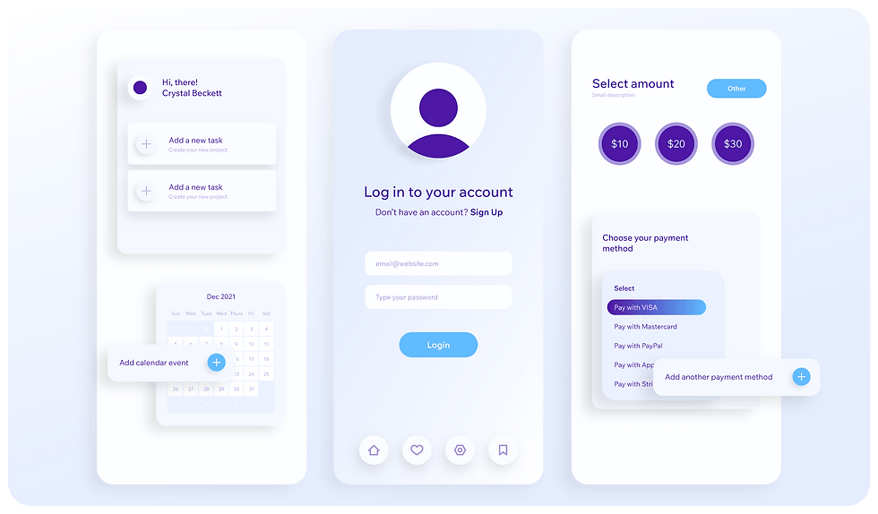
Google wanted a universal design language: practical, accessible, and consistent across all devices. They called it Quantum Paper before rebranding it as Material Design. The idea? Translate the physical properties of paper onto a screen.
Everything sits neatly in a grid
Elements “stack” using the z-axis
Shadows, gradients, and layering give a sense of depth
Bold colors, crisp typography, sharp iconography
It’s clean. It’s logical. It’s everywhere.
Flat Design (the broader trend)
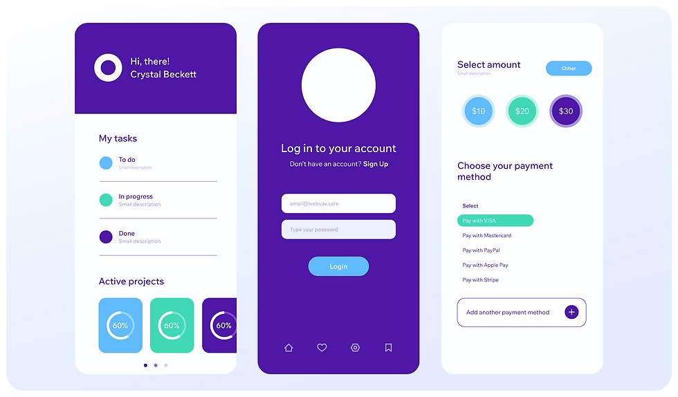
Flat design took things even further by removing shadows, eliminating depth, and flattening everything into a two-dimensional space. It was a direct rebellion against skeuomorphism (when icons looked like tiny real-world objects).
The upside: faster load times, cleaner UI, no clutter.
The downside: sometimes you can’t even tell what’s clickable.
Purely minimalist, no gradients or textures
Efficiency and simplicity over embellishment
Limited color palettes to reduce distraction
By the early 2010s, the web didn’t need to mimic the real world anymore. People were already fluent in digital. Buttons didn’t need to look like buttons; users just knew what to do.
Design Needs Its Humanity Back
In 2025, something is definitely missing: artistry, history, personality, and meaning. More importantly, what design means to the user, how it makes them feel, and what actions it encourages them to take.
Clarity and simplicity are necessary for digital functioning, but they aren’t the same as character. Somewhere along the way, we stripped design of its humanity. Everything looks polished, yes, but also eerily similar. Scroll through a dozen websites today, and you’ll swear you’ve seen the same grid, the same typography, the same color palettes recycled again and again.
You might be thinking, "Wait, Crystal, these design movements apply to the interface (menus, buttons, layouts), not the graphic side of things."
But here’s the catch: Material, and even more so Flat Design, crept into our graphics, backgrounds, and icons. The visual personality of the web flattened right alongside the UI.


Usability Doesn’t Have to Mean Uniform
Web design has the chance to do more than just function. It can set a mood. It can tell a story. It can draw from centuries of visual language, including ordered Constructivism, Dada’s avant-garde, immersive Fauvism, surrealist playfulness, and breathe that back into the digital space.
These movements weren’t just about aesthetics; they were about how people felt when they experienced them. It’s not about throwing out Flat Design. It’s about remembering that design is more than a usability checklist. In a world where most brands are chasing “sleek and modern,” the ones willing to be bold with visual identity will stand out.
The point is, function doesn’t have to kill flair. We can build intuitive, efficient interfaces while leaving people with an impression that feels distinct, memorable, and perhaps even reminiscent of the great masters.
So here’s my approach as a brand and web designer:
Figure out what your business wants to say, then match it with an art movement that speaks the same language.
Most visual languages aren’t even on the radar for modern designers. And artistic principles like medium, composition, contrast, balance, and color theory have always been at the core of great design.
Keep It Simple, But Make It Mean Something
Let me be clear. I’m not talking about a hundred moving parts layered with flashy animation, autoplay videos, or constant motion. That stuff can look cool, sure, but it often clutters the message and slows everything down → literally. Heavy assets like video and animation can drag down your site speed, harm the user experience, and undermine your SEO foundation!
You don’t need all the bells and whistles to stand out. You just need visual clarity with purpose. The difference is in the intention behind every visual choice, not the number of things flying across the screen.
And yes, I know what you’re thinking: "What about AI?" Let's talk about it.
The AI Effect on Content & Design
AI tools are changing the game for creating content and graphics. On the plus side, AI can speed up production, help generate fresh ideas, and create assets at scale that would take humans much longer. It’s a powerful assistant that lets you move fast and test new concepts without breaking a sweat.
But here’s the catch: a lot of AI-generated content ends up looking, well… the same. And the whole point of this post is to stand out! To use the artwork that speaks volumes about your industry. It must be specific. There’s a recognizable pattern in AI generated artwork: that beveled edge, overly polished style you see a lot in tech graphics.


So while AI is a fantastic tool to have in your design toolkit, it’s not a substitute for intentional, meaningful creativity. Use AI to boost your workflow, but don’t let it flatten your brand’s personality or the emotional connection your design can create.
Match Your Brand to an Art Movement
Let’s look at how brands in different industries can align their messaging with underused art movements that visually say the same thing.
Finance & Legal
Message: Stability, authority, refinement
Movement: Neoclassicism
Why: Balanced, rational, and rooted in time
Tip: Use symmetrical layouts, serif typography, and muted color palettes
Fashion & Creative Agencies
Message: Edge, rebellion, avant-garde
Movement: Dadaism
Why: Rule-breaking, irreverent, and disruptive
Tip: Play with collage, overlap, unpredictable typography, and clashing colors
Entertainment & Events
Message: Bold, immersive, high-energy
Movement: Fauvism
Why: Explosive, unfiltered emotion, and wild brushwork
Tip: Oversized visuals, vibrant color blocks, and punchy motion graphics
Luxury Wellness & Boutique Hospitality
Message: Elegance, indulgence, escapism
Movement: Rococo Revival
Why: Ornate, whimsical, and luxurious
Tip: Layer delicate patterns and textures, use elegant serif or script pairings
Indie Brands, Toy Brands, & Gen Z Retail
Message: Fun, nostalgic, offbeat
Movement: Pop Art
Why: Irreverent, loud, and rooted in culture
Tip: Combine retro fonts, halftone effects, pastel-meets-neon color palettes
Technology & SaaS
Message: Futuristic, experimental, system-driven
Movement: Retro Cybernetic
Why: Patterned, algorithmic, and forward-thinking
Tip: Use grid-based layouts, subtle algorithmic patterns, and restrained color palettes
Honorable Mentions:
Vorticism: For gritty, urban brands with edge and motion
Suprematism: For ultra-minimalist, conceptual experiences
Precisionism: Perfect for real estate, industrial, and manufacturing
Vienna Secession: Like Art Nouveau but sleeker and more graphic
Bottom Line
Functionality and design can and should coexist. You don’t have to choose between something being practical and something being beautiful; a well-made website can and ideally will be both.
By bringing intentionality and visual language back into your designs, you can create sites that do more than just work. They'll resonate, tell a story, and leave a lasting impression.
Happy designing!